DATE HERE
Use a comma in numbers at least 10,000. Do not use commas in numbers less than 10,000.
Use an en dash to indicate a range of numbers.
N.B.: The words "from... to..." also denote a range. The two
idioms do not mix.
WRONG: Over 1,000 students showed up for the event, which was held from 3:00-6:00 in Rangos.
RIGHT: Over 1000 students showed up for the event, which was held from 3 pm to 6 pm in Rangos.
The Tartan uses dots in abbreviations very sparingly. For example, we use "UN" and "EU" instead of "U.N." and "E.U." There are two major exceptions to remember:
WRONG: The US Mint has operations in Denver, CO and San Francisco, CA.
RIGHT: The U.S. Mint has operations in Denver, Colo., and in San Francisco, Calif.
We use the AP state abbreviations, except for Pennsylvania (Pa., not Penn.), and we put dots in "U.S."
Whenever an abbreviation dot coincides with an end-of-sentence period, one of the dots disappears. After a sentence ending in such an abbreviation or ending in a capital letter, we use two spaces instead of one to make the sentence break clearer.
RIGHT: Today we celebrate the life of Dr. Martin Luther King Jr. Go, Dr. King!
RIGHT: For more information, see Appendix C. Or see Ferguson's new book, Encephalophopod and Other Stories.
Commas set off personal titles whenever those titles follow a name. They do not set off initial titles or descriptors.
WRONG: Jimmy Neutron, boy genius said that he was working on an invention.
RIGHT: Jimmy Neutron, boy genius, said that he was working on an invention.
RIGHT: Boy genius Jimmy Neutron said that he was working on an invention.
Other punctuation marks used to set off parenthetical remarks: comma, em-dash, parentheses. You can use paired em-dashes — like this — or parentheses (like this), or commas, like this. Note that coinciding dashes and commas "cancel" (at least in American style), but parentheses inside commas don't.
Avoid awkward constructions involving parentheticals.
DUBIOUS: The summit was attended by representatives of the G5 nations (France, Germany, Japan, the UK, and the U.S.).
This is the correct way to punctuate this sentence, but it is incredibly ugly.
BETTER: Representatives of the G5 nations (France, Germany, Japan, the UK, and the U.S.) attended the summit.
We use the serial comma in all cases. The serial semicolon, which is used whenever one of the items in a list contains a comma, is always terminated with a comma — never with a semicolon.
RIGHT: Sinful Caesar sipped his snifter, seized his knees, and sneezed.
RIGHT: Filmed on location in Boston; Washington, D.C.; and Philadelphia, this movie is a sure draw for travel buffs.
WRONG: H. 2697 proposes that the funds in question can be used for either operating expenses or for capital projects.
WRONG: The whereabouts of the bunker are only known to a select few.
WRONG: It's not hard to draw parallels between Ware's and Schultz's styles, especially when one arms himself with a collection of the latter's work.
WRONG: Once an article has been edited by their respective section editor, the editor-in-chief edits it.
WRONG:One would not want to listen to their favorite rock station by tuning into their gamma-ray radio; the sheer energy of these high frequencies would give you radiation poisoning before the song was over.
DEBATABLE: Someone left their calculator in Wean 7500 yesterday.
The Tartan does not use the generic pronoun "him," as in "Someone left his calculator in Wean 7500 yesterday." However, we don't have much of a policy as to what we do use. The best course of action is usually to avoid the question altogether.
BETTER: A calculator was left in Wean 7500 yesterday.
BEST: Two people left their calculators in Wean 7500 yesterday.
The word the is sometimes capitalized (The Tartan, The New York Times), but not always! Cf. the Salvation Army, the College of Fine Arts.
The past tense of the verb "to lead" is "led," not "lead." This mistake is rarely made, but it's also rarely caught, probably because editors are reading with their ears instead of their eyes.
The words many, few, and those are adjectives, not nouns!
BAD: Many feel that the proposal is poorly considered.
BAD: While those who support it tend to be liberal, few believe it is truly the best solution.
Write "many students," "those voters," "few liberals," if that's what you mean. Don't keep the reader guessing!
WRONG: They could have played their scenes, like the one in the kitchen, more forcefully.
Does this mean that they should have been more forceful, more like the scene in the kitchen? or that they should have been more forceful in all of their scenes, including the one in the kitchen?
PRESENT TENSE: He may have gone to the store.
PAST TENSE: He might have gone to the store.
WRONG: He didn't have any friends in grade school. The Happy Fun Ball may have made him some.
These last three slides have shown examples of bad writing that are hard for an editor to correct without ESP. If you see something that you don't understand and can't fix, first try research; if that fails, you can always contact the writer and ask for a clarification.
WRONG: Team captain Lucy Van Pelt said: "We played really well out there today." She added that, "we need more defense."
RIGHT: Team captain Lucy Van Pelt said, "We played really well out there today," but added that the team needs "more defense."
Use the proper punctuation to set off quoted material from the main text. When you incorporate a quote into the flow of the sentence, don't use any punctuation to set it off — it should just flow right along.
When you need to report a complete quotation, use a comma to set it off from the rest of the sentence. You can also use a colon, period, or other end-of-sentence punctuation, but only if you know how.
WRONG: Team captain Lucy Van Pelt said: "We played one heck of a game out there today."
RIGHT: Team captain Lucy Van Pelt was jubilant: "We played one heck of a game out there today."
SHOW-OFF: How was Van Pelt taking the loss? "We played one heck of a game out there today," she said, "but we just weren't good enough. I blame our shoddy defense."
There are some things The Tartan does differently from other papers; you just have to learn them by heart. (Or leave them to your poor copy editors!)
OKAY: Some teachers tell their students to avoid sentences beginning with conjunctions. But I really don't care one way or the other.
OKAY: Sometimes, to truly capture the cadences of informal English, you have to split an infinitive. But you should try not to.
DUBIOUS: Clauses which end in prepositions are usually something it's worthwhile to fight against, but sometimes you just have to let one go.
DUBIOUS: Some teachers (mine included) say that this and that shouldn't be used as pronouns. That's usually good advice, especially in sentences like this.
Each article in every section, with the exception of board editorials, goes through four stages of editing by the copy staff. Before those stages, an article will be read by the appropriate section editor and by J.T. Then there are two online passes:
Following these four proofreading stages, the page goes to "Finals." In this stage, it is examined (more or less carefully, depending on exhaustion) by its section editor and by the Editor-in-Chief, and by the Copy Manager as long as he's still in the office. If the copy and layout staffs do their jobs properly, there shouldn't be anything left to mark on Finals pages.
On the intranet: Look for articles at Copy Ready and Copy One. Edit them, and then advance them to Copy One or Layout/Proofing, respectively. If an article at Copy One has irreparable problems (e.g., a sentence so confusing that you can't understand it at all, unless it's in a piece written by Al Cohen or Max Kaufmann; or an argument based on a faulty premise, unless it's in a Forum editorial; or a case of blatant plagiarism) then mark them and set the article's status to "Sent Back To Editor".
In hardcopy: Make sure the top right-hand corner of the page is marked either "2nds" or "3rds". Sign your initials under that mark. Edit the page. Then, if and only if there are two sets of initials at the top of the page, take it back to the person whose initials are marked on the back of the page. If you can't find that person, put the page in the file system under the light table, on the appropriate shelf (e.g., a 2nds of page A3 would go on the shelf marked "Broadsheet 2nds In Progress").
Each of the following proofreading marks either is in widespread use, or is a simplified version of a common mark. Use these marks assiduously, and try not to make up cryptic new marks unless absolutely necessary. Write explanations in the margins, whenever possible, and make sure there is a clear link between the trouble spot and the explanation!
Mark Meaning Slash through capital letter Make lower-case Double underline lower-case letter Capitalize "S-curve" around letters or phrases Switch positions. Show clearly what changes need be made to punctuation. Slash or X through single letter Remove and close gap Slash or X through hyphen Replace hyphen by space "Ties" above and below space or hyphen Close gap; make two words into one Underline Italicize or de-italicize Strike-through Remove; write new text in margin Circled hyphen or dash Wrong kind of dash; write "1/m" or "1/n" in margin if necessary Circle in right margin Bad hyphenation or line break Box around phrase; "w.c." or "awk." in margin Awkward wording; always suggest new wording Circle around three consecutive quote marks Insert thin space appropriately; write "thin space" in margin if possible Circled period Insert period Draw in quote mark Insert apostrophe; a circle around the trouble spot may be needed to draw attention Oval at side or bottom of page, "cut off" in margin Text or image frame cut off by edge of page Box in whitespace area (to right of headline or at bottom of article, typically) Unacceptable whitespace. Enlarge headline or reflow article to take up more space Line, word "tight" Layout too tight Oval, word "loose" Layout too loose Arrows pointing from frame element to line (image or paragraph indent, typically) Move or expand frame element to touch line Square brackets around line, word "tight" or "loose" Spacing too tight or loose in line; layout must hyphenate or reflow by hand "Lightning bolt" between columns Text baselines do not line up Hash mark: # Insert space Slashes both sides of em-dash Em-dashes should have one space either side; insert spaces Circle around interword space Two spaces where there should be one; remove extra space
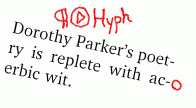
The book Digital Typography, of which there is a copy in
the office, has a small section on hyphenation rules. Basically, avoid
discretionary hyphens that would leave two letters in the lower half
(e.g., "poet-ry", and even plurals such as "auth-ors" if possible);
avoid hyphenating before "half-syllables" (e.g., "peo-ple" or "am-ply");
and avoid hyphenations that produce misleading upper halves (e.g.,
"ac-idic, oc-cupant, la-ther, fa-ther" versus "ac-tive, oc-elot, la-tex,
fa-vorite").
If you see a word with two letters in the lower half, don't bother to circle it. Instead, mark the top of the article so that the layout staffer can fix the whole piece from within InDesign. If you see a bad hyphenation (according to the above rules), mark it with a circle in the right margin, next to the hyphen.
Whenever possible, discretionary hyphens should go between word elements; e.g., "milli-second" instead of "mil-lisecond" or "millisec-ond".
Don't worry about other hyphenations you might think are bad. We can't eliminate every hyphen! (Not without making the page look really bad, that is.) In particular, most hyphenations with two-letter top halves are okay, and so are hyphenations with bottom halves of "-ing" or "-able". If you mark these, you risk either drowning out more important corrections in a sea of ink, or else forcing strained interword line breaks and tight or loose lines, which are more jarring than any hyphenation to a newspaper reader.
When in doubt, leave it! But there are some obviously wrong cases that should always send up a red flag. InDesign has produced many weird hyphenations, including "Shaba-zz's" in a recent issue. (That hyphenation was caught and fixed in 2nds.) Other bizarre hyphenations include "Ke-nya" and "DeY-ager".
Broadsheet pages use two font families: Trade Gothic (for kickers, which are Trade Gothic Bold) and Charter (for everything else, including photo credits). The format for bylines is
by Harry Q. Bovik
Staffwriter
E-mail addresses, newsgroup names, and URLs go in the same roman font as the rest of the body text, but slanted 12 degrees to the right. All other forms of emphasis — grammatical emphasis; book, movie, and video game titles; and italic headlines themselves — go in the italic version of the body-text font.
| Text is currently in | Text should be in | Indicate inline | Indicate in margin |
|---|---|---|---|
| roman | italics | underline | (optional) write ital |
| roman | slanted | underline | write slant |
| italics | roman | underline | (optional) write deital |
| italics | slanted | underline | write slant |
| slanted | roman | underline | (optional) write deslant |
| slanted | italics | underline | write ital |
| anything | bold | circle or box | write bold |
| bold | roman | circle or box | write debold |
| bold | italics | circle or box | write debold, ital |
Pillbox is The Tartan's tabloid section. Our tabloid pages use Charter for body text and Trade Gothic Medium for captions, photo credits, and Calendar.
Trade Gothic Oblique is a slanted font; therefore there is no difference between "slanted" and "italic" faces in Pillbox captions and credits.
The headers at the tops of Pillbox articles ("turntable", "on campus", and so on) are done in the Skia Regular typeface. Each header should end with a square period. The line running along the top of each Pillbox page should enter flush with the bottom of that period on both sides, and run right into the period from the right. The left-hand half of that line should stop a few points short of the header text.
Pillbox bylines are done in the MrsEaves small-caps font and come at the ends of articles, rather than at the beginning as in the broadsheet sections. Still, the order of byline elements is the same: name, then position. There should always be exactly one blank line between the end of the article text and the byline.
On Saturday - despite an injury to his leg - Ferguson scaled Mount Doom, becoming the first man to do so since the ill-fated Baggins expedition of 1418--1419.
Don't worry about curly quotes on the intranet. They can be replaced automatically by doing a search-and-replace operation within InDesign. The one place it is useful to insert curly quotes by hand is in phrases such as "the '90s." The apostrophe before the "9" should be a right curly quote. InDesign will get this wrong by default.
Replace all instances of the "ellipsis" character (option-; on Macs) with three periods. Of course, make sure there are the right number of dots and spaces also!
Bracket any text that should be in italics with the sequence [ITAL]. Bracket any text that should be in slanted font with the sequence [SLANT 12]. If you have any critical comments, put them in brackets and capital letters as well, and append your Andrew userid.
To read an online copy of Carnegie's [ITAL]Round the World[ITAL], point your browser at [SLANT 12]www.gutenberg.org/dirs/etext04/7rwrl10.txt[SLANT 12]. [CAN WE FIND A SHORTER URL FOR THIS? -ajo]