
A Guide to Use of our Logo and Name on Publicity
Created by PR Director Adam Shlian -- June 5, 2000
Hello Board and other readers!
I have spent much time revamping the Scotch'n'Soda Theatre logo. I now unveil it to you.
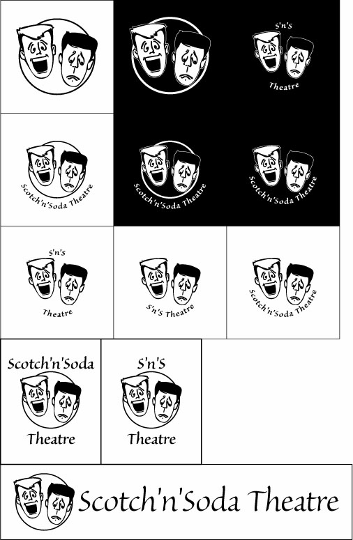
Shown in this JPEG are several variations on a logo.
ALL OF THESE VARIATIONS ARE VALID. THIS IS NOT MULTIPLE CHOICE. THIS IS NOT AN EXCLUSIVE SET.
Please read this document in its entirety at some point, but if you're in a rush, please scroll down to the last part, (V. Now...).
I. Specs:
A. Typeface: Sanvito MM (Multiple Master)
Sanvito is an upright script typeface designed by Robert Slimbach in 1993. Named after one of the principal scribes of the Italian Renaissance, Sanvito is based on the highly practical book hands of the Renaissance humanists. It was designed to combine the spontaneity and liveliness of calligraphic writing with the clarity and practicality of a more formal typeface. Sanvito is a multiple master typeface with design axes for weight and optical size. The optical size axis allows larger points sizes to maintain a delicate appearance, while smaller sizes have sufficient heft and openness to maintain legibility. Sanvito can be used for display settings and for informal purposes such as correspondence, flyers, and letterheads. Sanvito is a trademark of Adobe Systems Incorporated.
B. Image: MODIFIED Mic & Mike, Chester & Chumley, etc.
I'm not sure about the history of this image, but I know that it has been used by our organization for over a decade (I'98 incorporated the logo from I'88, which featured the image). As such, it has come to be a significant mark of Scotch'n'Soda's identity. I have set the faces free from the confines of the old logo's square box, and rotated them slightly outwards. With a circle dropped behind them, the image is dynamic and appealing... well, more so than it ever was.
C. Copy (text): Variable
Yes, variable. I feel that there should be options. I propose: Scotch'n'Soda Theatre S'n'S Theatre
The RESTRICTIONS that I place are: 1) Always use apostrophes around the letter n. Never use spaces, hyphens, or any other characters. 2) The words are to be in Title Case. That is, the first letter of each word (Scotch, Soda, Theatre) are to be capitalized. No other letters are to be capitalized, especially not the n. 3) The copy should always be set in Sanvito. 4) Whether S'n'S or Scotch'n'Soda, the copy for that phrase is to be kept together in one line. It should not be split and graphics should not break it apart.
The RECOMMENDATION that I have is: 1) Append the word "Theatre." I do not want to require this, though.
D. Additional Copy (tagline): Variable, when appropriate
Yeah, I'm pushing for "All About Us" for PR directed to incoming freshmen and new members. A tagline is far from necessary. And, there's no need to specify a typeface for it as far as I can see.
II. Why revamp?
First, let me say that this is a revamp and not redesign because we're a student organization and we need to maintain continuity.
I analyzed the problems with the old logo and set about finding solutions: 1) Inflexibility. The mark could not be manipulated to work with a show's publicity. Our mark should be flexible. I propose a virtually limitless family of marks, all of which communicate who we are, but do so in a way that does not impede our intentions. 2) Static. A square is a boring and rigid shape. Look at the old publicity and you'll see our logo is like a stamp on publicity. I propose that the logo be more of a seal, if you see the difference. 3) Illegibility. The old logo was, I believe, hand drawn and then vector-traced. The letterforms are hand-drawn and horribly outlined. At a small size, they're unreadable; at a large size they're ugly. I propose a typeface be used as part of the logo. 4) Miscommunication. Hard to believe, but some people thought that the happy face was named Scotch and the unhappy face was named Soda. This is mostly because of the placement of the 'n'. All kinds of connotations can be interpreted from such a read, both consciously and subconsciously. I propose putting the name of the organization together as a phrase; there's no need to incorporate it into the image.
III. Why Sanvito?
I started my typeface search with a list of requirements (this is excerpted from an e-mail back in mid-May). 1. Must play well with others. I want a typeface that's not going to compete with whatever the show/troupe's logo may be.
2. Not computer-ey. I've been looking at other drama organization logos. Anything goes, it seems, but most tend to have a handmade, human quality.
3. Must have good loookin' apostrophes. I want the logo to be more flexible, so it should look decent, whether it says
Scotch'n'Soda Theatre S'n'S Theatre
4. I'm thinking of maybe curving the text around a circle. This makes it trickier to find a decent un-geometric typeface, but it's something to keep in mind.[END EXCERPT]
These requirements led me to investigate humanist typefaces. I went through a list of over 600 typefaces, narrowed it down to 26, mostly humanist. Then 20. Then 4. This took a lot of time; please don't think my choice is arbitrary.
IV. How to implement
So, upon gaining approval from the board (or taking any criticisms/suggestions under advisement and submitting another version), this mark will appear on publicity henceforth. I have time to implement it on the APhiO flier, the very first piece of publicity that will be released this year.